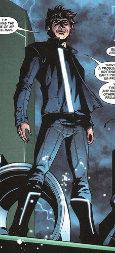
While Daft Punk continues to shape up, I'm taking on a side project during the lull periods (while I wait for rubber, or while it's too cold to fiberglass, stuff like that). Prior to the release of Tron Legacy, Marvel Comics released a two-part comic prequel to the movie, highlighting the evolution of the Grid and Flynn's early days of "new management" in the system. It also serves to add to CLU's story of how he got to where he was at the beginning of the movie (though it doesn't complete the story; the video game Tron Evolution fills in more of the gaps). Throughout both issues (and the video game, and even in some of the flashback sequences of the movie), Kevin Flynn's Grid outfit consists of "Trony" pants (with raised details and glowy bits), a dark gray shirt, and a black jacket that has a single lighted band down the front as it's primary detail.
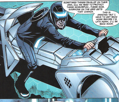
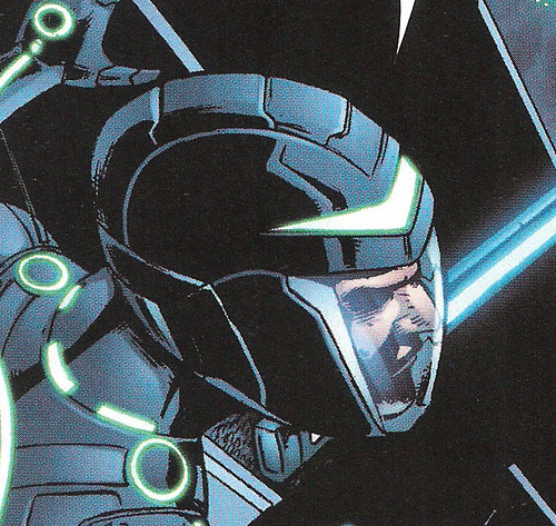
In one particular panel, he is wearing a helmet while riding his light cycle, and this same helmet is seen being worn by anonymous grid game combatants. Certain details in the comics, as well as the fact that Sam's helmet in the movie was the same as the other gladiators, we can assume that there are generic style helmets in the new Tron world, and that this is one of them.
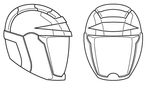
I started my work by producing a quick sketch of the helmet as I perceived it from the details in the comic, and then I produced a set of blueprints in Adobe Illustrator. I'll state right now that the shape of the side profile was changed in the 3D model stage from what you see in these blueprints, so my final product will not exactly match the blueprints.
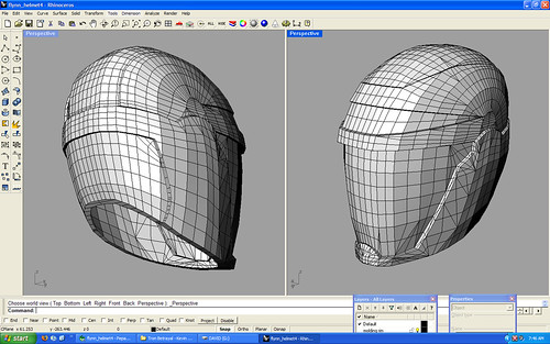
From there I built a 3D model in Rhino 3D. When I built the 3D model, I originally built it according to the blueprints. However, I found that something was off about the overall shape of it, so I skewed it front to back to give it more of the look that the helmet in the side view in the comic has. It didn't need to be skewed much, but just breaking the overall rectangular shape really helped out. You can't really see it from this image, though.
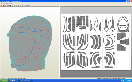
Continuing onward, I brought the 3D model into Pepakura and produced a foldable paper model. I didn't think about this by the time the model was ready to print, but I had to do a little math to scale the helmet because I have a molding rim modeled onto it that counts toward the overall height of the model (in Pepakura, you scale a model according to it's height). And that's where I'm at right now. I haven't printed it out yet, and what you see represents about 7 hours of work so far.
Please note: I will not be distributing this Pepakura model. As I've stated before, I consider the Pepakura model to be like a "clay model" stage, and thus is not intended to be a final product. Please do not ask for the Pepakura file, as you will not receive it.

Very nice! Only problem I think I can see is that the helmet in the comic seems to be angled back than the model that you've created, though it could just be an illusion from the images.
ReplyDeleteI addressed that. I mentioned that I skewed it front to back because my blueprints were more rectangular in shape than the tear-drop shape of the comic helmet. I didn't do it too much, though. If you notice on that side view in the comic, the wearer is at an angle where we're looking down at him. It's not a straight-on side shot. So if you take that same shape and rotate it so that you're looking at it on a flat plane, it's not as harsh of a slant.
ReplyDeleteAlso, to make it a little more feasible of a helmet design (considering that it's a pretty tight-fitting helmet), i wanted to make it closer to the shape of the human head. If it had a similar harsh slant to it, there would be no way to make it fit on a head and maintain the proper scale. Dialing down the slant on it will also allow for a bit more room in the forehead for the lighting.
For comic book stuff, you really have to input a lot of artistic license into the design if you are making it into a real object. Comic artists are always under a tight deadline and often don't care too much about consistency of shape and proportion among panels. They definitely try to get it right, but they're not going to agonize over something if it looks right in general and serves the purpose of visually telling the story. So as a prop builder, I find that when interpreting a comic book item, I have to fill in the gaps and make necessary changes. The trick, though, is to maintain the spirit of the original artwork as best you can.
Great comment. I thought a LOT about the slant while I was modeling and how to address it.
So just the helmet? Or the whole shabang?
ReplyDeleteHey by any chance can i purchase that Pepakura file off you? its AMAZING!
ReplyDeleteHappyEmo64@gmail.com